
At its heart, technical analysis is the practice of forecasting where prices might go next by studying past market data—primarily price and volume. Think of it as being a market meteorologist. Instead of analyzing a company’s financial health, you’re reading historical patterns on charts to predict the financial weather ahead.
What Is Technical Analysis and Why It Matters
Imagine trying to guess the day's weather by only glancing at the blue sky outside your window. You'd be ignoring the fact that storm clouds were gathering yesterday or that it’s the middle of hurricane season. You're missing critical context. In the financial markets, looking only at a company’s latest earnings report without studying its price history is a similar misstep.
Technical analysis offers a completely different lens. It’s built on one core belief: all known information, from earnings reports to broad investor sentiment, is already baked into an asset's price. So, instead of asking why a price is moving, a technical analyst focuses on what it’s doing right now and what it did in the past.
Reading the Market's Footprints
Think of a price chart as a sandy beach and the price movements as footprints. An experienced tracker can glance at those footprints and tell a whole story. They can see the direction of travel, estimate the speed, and even spot signs of a struggle.
In much the same way, technical analysis is about reading the "footprints" left behind by buyers and sellers. These patterns reveal the collective psychology of the market.
- Upward Trends: Show that buyers are firmly in control, consistently pushing prices higher.
- Downward Trends: Indicate that sellers have the upper hand, driving prices lower.
- Sideways Movement: Suggests a standoff or a period of indecision between buyers and sellers.
By spotting these patterns early, traders try to align their decisions with the market's prevailing mood, helping them act at more opportune moments.
A Time-Tested Approach to Markets
This isn't some new-fangled idea. The practice of charting and analyzing market data has been around for centuries, proving its staying power. Its roots can be traced all the way back to the Amsterdam securities market in the 17th century, where merchants charted price movements to speculate on trends. Around the same time, Japanese rice traders were developing candlestick charting—a technique that remains a cornerstone of modern analysis today. You can learn more about this rich history over at Quantified Strategies.
The central idea is that history often rhymes in financial markets. Human emotions like fear and greed, which are the ultimate drivers of buying and selling, tend to produce similar patterns over and over again.
How Technical Analysis Helps Traders
Ultimately, technical analysis gives you a structured way to make sense of market chaos. Platforms like the Fear & Greed Tracker are built on these principles, visualizing market sentiment so you can get an instant read on whether fear or greed is in the driver's seat.
Here’s a look at how a platform can bring key technical and sentiment data together in one clear view.
This dashboard combines a live Fear & Greed score with price changes and trend data, giving you a quick snapshot of the market's emotional state. By understanding these dynamics, you can start to spot potential opportunities that others might overlook.
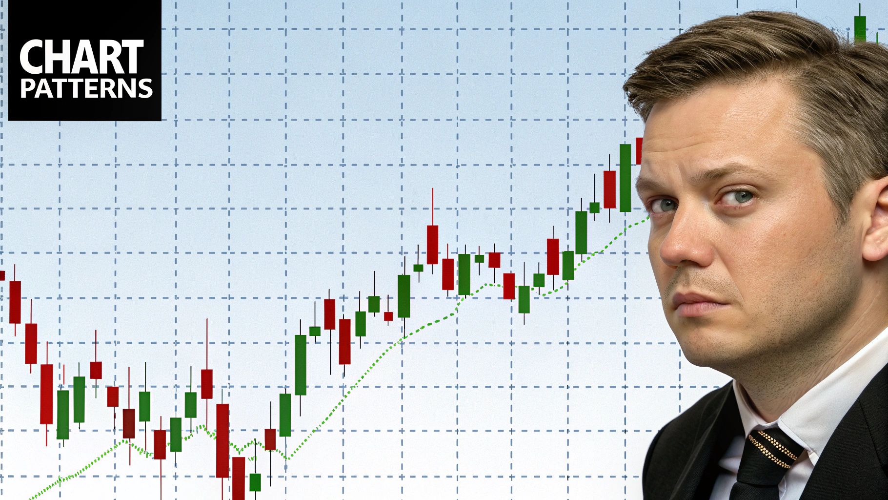
Learning to Read the Market’s Language with Charts
If technical analysis is the art of studying market behavior, then charts are the language it’s written in. A chart isn't just a jumble of lines and bars; it's a visual storybook detailing the constant tug-of-war between buyers (demand) and sellers (supply). Learning to read that story is the first real step into the world of technical analysis.
Don't get bogged down trying to memorize complex patterns. Your first goal is simply to understand the visual narrative of price action. Think of it like this: a story can be a short summary or a chapter-by-chapter epic. Each chart type offers a different level of detail, giving you the version of the story you need.
Let’s break down the three fundamental types every new trader should get comfortable with.
The Simple Line Chart
The most basic and cleanest way to look at price movement is the line chart. Imagine getting a daily market report that tells you just one thing: the closing price. That's exactly what a line chart does—it just connects the dots between a series of closing prices over time.
This simplicity is its biggest advantage. By cutting out all the intraday "noise" from price swings, a line chart gives you a crystal-clear, high-level view of the primary trend. It’s perfect for quickly spotting whether the market is generally heading up, down, or sideways without getting lost in the weeds.
The More Detailed Bar Chart
When you’re ready for a bit more detail than just the close, you graduate to the bar chart. Each bar on this chart tells a fuller story of a single trading period (like a day or an hour) by showing four key pieces of information:
- The Open: The small horizontal tick on the left of the bar shows where the price started.
- The High: The very top of the vertical bar marks the highest price the asset reached.
- The Low: The bottom of the bar shows the lowest price reached.
- The Close: The small horizontal tick on the right reveals where the price ended.
This "OHLC" (Open, High, Low, Close) data gives you a much richer sense of a period’s volatility. A long vertical bar means there was a wide price range and a real battle between buyers and sellers. A short bar, on the other hand, points to a quiet, less eventful period.
Japanese Candlestick Charts: The Trader's Favorite
By far the most popular chart among traders is the Japanese candlestick chart. It shows the same OHLC data as a bar chart, but it does so in a way that’s incredibly visual and intuitive for reading market psychology.
Each candlestick is made of two parts:
- The Body: This is the thick, rectangular part. It represents the distance between the opening and closing price. The color tells you who won the battle for that period—it's typically green (or white) if the close was higher than the open (buyers won) and red (or black) if the close was lower (sellers won).
- The Wicks (or Shadows): These are the thin lines sticking out from the top and bottom of the body. They show the highest and lowest prices reached during the period.
The real magic of candlestick charts is how they visually scream market sentiment. A long green body shows powerful buying pressure, while a long red body signals aggressive selling. The length of the wicks can reveal indecision or show that prices were rejected at certain levels.
Learning to read these visual cues is less about memorizing patterns and more about interpreting the story. For example, a candle with a long upper wick tells you that buyers tried to push the price way up, but sellers swooped in and shoved it back down—a potential sign of weakness.
This focus on psychology is why many traders combine chart analysis with other sentiment metrics. You can learn more about reading the market's mood in our guide to understanding what social sentiment is. When you combine these tools, you start to build a much more complete and powerful picture of what’s really happening in the market.
Building Your Toolkit with Key Technical Indicators
If charts are the map where the market's story unfolds, then technical indicators are your compass and magnifying glass. These tools are basically mathematical calculations based on an asset's price, volume, or both. They help you cut through the noise, confirm what you're seeing, and spot potential trading opportunities that might otherwise be invisible.
Think of it like being a detective. The price chart gives you the overall scene, but indicators help you find the specific clues—the fingerprints, the footprints, the stray fibers—that point toward what's most likely to happen next. They add a layer of objective data to the subjective art of reading charts.
Let's dive into a few foundational indicators. We won't just cover what they are, but how you can actually start using them to build a practical and effective analysis toolkit.
Smoothing Price Action with Moving Averages
The most fundamental and widely used indicator is the moving average (MA). Its job is simple but powerful: to smooth out the chaotic, day-to-day price swings to give you a clearer view of the underlying trend. It does this by calculating the average price of an asset over a specific number of periods.
For example, a 50-day moving average shows the average closing price over the last 50 days. By plotting this average as a single line on your chart, the short-term "noise" gets filtered out, revealing the market's real direction.
You'll mainly encounter two common types:
- Simple Moving Average (SMA): This is the most straightforward average of prices over a set period. It's a fantastic tool for identifying long-term trends.
- Exponential Moving Average (EMA): This type gives more weight to the most recent prices. Traders often prefer the EMA for short-term analysis because it reacts much more quickly to new price information.
A classic strategy is to watch how the price interacts with the moving average line. If the price is consistently trading above the MA, it helps confirm an uptrend. If it's below, it signals a downtrend. Crossovers, where a shorter-term MA crosses above or below a longer-term one, can also signal a potential shift in the trend.
Measuring Market Momentum with Oscillators
While moving averages are great for seeing the trend's direction, they don't tell you how strong that trend is. For that, we turn to momentum oscillators. These indicators move, or "oscillate," between set high and low values, helping you gauge the speed and strength of price movements.
One of the most popular momentum oscillators is the Relative Strength Index (RSI). The RSI measures the magnitude of recent price changes to figure out if an asset is "overbought" or "oversold."
The RSI is shown as a line graph that moves between 0 and 100. A reading above 70 is typically considered overbought, suggesting the asset may be due for a price pullback. A reading below 30 is considered oversold, suggesting it might be ready for a bounce.
Now, it’s critical to remember that "overbought" doesn't automatically mean "sell," and "oversold" doesn't mean "buy." Think of them as alerts that the current trend might be running out of steam and a reversal could be on the horizon. The key is to use these signals to confirm what your other analysis is telling you.
When you combine chart patterns with momentum readings, you get a much clearer picture of the market's psychology. To go even deeper, you can explore our guide on how to use market sentiment analysis for trading.
The image below shows how the RSI, moving averages, and another popular indicator, the MACD, work together on a price chart.
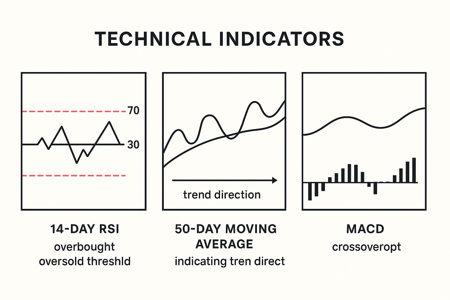
This visual is a great example of how the 50-day moving average can confirm the overall trend, while the RSI and MACD provide signals about momentum and potential turning points.
A Quick Comparison of Key Indicators
To help you choose the right tool for the job, here's a simple breakdown of the indicators we've discussed, plus another popular one, the MACD.
Comparing Key Technical Indicators for Beginners
| Indicator | Type | Primary Purpose | What to Look For |
|---|---|---|---|
| Moving Average (MA) | Trend-Following | Smoothing price data to identify the direction of the trend. | Price crossing above/below the MA; MA crossovers. |
| Relative Strength Index (RSI) | Momentum Oscillator | Measuring the speed and change of price movements to identify overbought/oversold conditions. | Readings above 70 (overbought) or below 30 (oversold). |
| MACD | Trend & Momentum | Identifying changes in the strength, direction, momentum, and duration of a trend. | Crossovers of the MACD line and signal line. |
| Bollinger Bands | Volatility | Visualizing market volatility and potential price breakouts. | Bands widening (high volatility) or squeezing (low volatility); price touching the outer bands. |
This table should give you a good starting point for understanding which indicator to reach for depending on what you're trying to figure out in the market.
Understanding Volatility with Bollinger Bands
Finally, let's touch on a volatility indicator. Volatility simply tells you how much an asset's price is swinging. High volatility means big price moves, while low volatility means the price is relatively stable. Bollinger Bands are an excellent tool for visualizing this.
Bollinger Bands are made up of three lines plotted on a chart:
- A simple moving average in the middle.
- An upper band that is typically two standard deviations above the MA.
- A lower band that is two standard deviations below the MA.
The bands widen when volatility picks up and contract (or "squeeze") when volatility dries up. A "squeeze" often happens right before a significant price move, though it doesn't predict the direction. When the price touches the upper band, it might be overextended; when it hits the lower band, it could be oversold.
The widespread use of tools like these is a testament to their value. Some surveys estimate that between 60% and 80% of market participants use some form of technical analysis in their strategies, with moving averages and RSI being among the most popular. This practice exploded with the rise of online trading platforms, which gave everyday traders access to the same tools as the pros.
Understanding Support, Resistance, and Trends
If technical indicators are your compass, then trends, support, and resistance are the terrain you're actually navigating. These three ideas are the absolute bedrock of technical analysis. They form the staircases, floors, and ceilings of the market, giving structure to every price move.
Getting a firm grasp on these concepts isn't just helpful—it's non-negotiable. They provide the essential context for every single chart pattern and indicator you'll ever look at.
Identifying the Market's Direction with Trends
At its core, a trend is simply the general direction a market is heading. It's the market's prevailing bias, telling you at a glance whether the buyers or sellers have the upper hand. Think of it like a river's current; you’d want to know which way it’s flowing before you jump in.
You'll quickly learn to spot three main types of trends:
- Uptrend: This looks like a clear "staircase" climbing upward. The price carves out a series of higher highs and higher lows. This is a classic sign of optimism, showing that buyers are consistently stepping in, even after small price dips.
- Downtrend: The exact opposite—a staircase heading down. Here, the price forms a pattern of lower highs and lower lows. This tells you sellers are in control, and every attempted rally gets pushed back down with more selling pressure.
- Sideways Range (or Consolidation): This happens when the price gets stuck between a relatively stable high and low. It moves more like a ball bouncing in a hallway than one going up or down stairs. This signals a period of indecision where buyers and sellers are in a temporary stalemate.
To make these trends pop, analysts draw trendlines. An uptrend line connects the rising lows, while a downtrend line connects the falling highs. This simple line acts as a powerful visual guide to the market’s momentum.
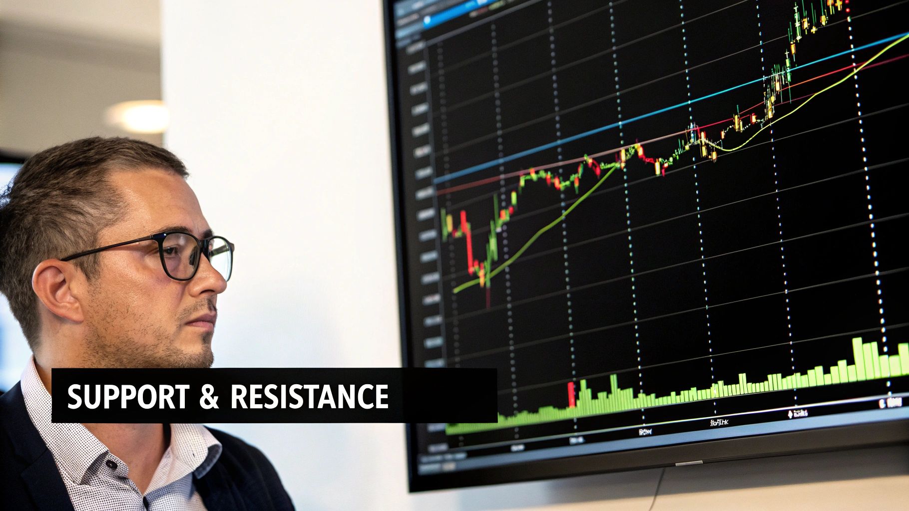
The Floors and Ceilings: Support and Resistance
Now, let's talk about those floors and ceilings that define the trends. We call them support and resistance levels. They represent key price zones where the tug-of-war between buyers and sellers really heats up.
Think of a tennis ball bouncing in a room. The floor stops it from falling further, and the ceiling stops it from rising higher. Support and resistance work in a very similar way for asset prices.
Support is the price "floor." It's a price level where a concentration of buyers is expected to show up. They see value at that price and start buying, preventing the price from dropping any further. When the price approaches support, it’s like our tennis ball hitting the floor—it’s likely to bounce.
Resistance is the price "ceiling." This is a price level where a surplus of sellers is lurking. Sellers become more aggressive here while buyers get hesitant, causing a rally to stall and often reverse. This is the ceiling that stops our tennis ball from going any higher.
When Roles Reverse: A Powerful Market Signal
Here's where things get really interesting. What happens when our tennis ball is hit so hard that it smashes right through the ceiling? That old ceiling now becomes the new floor. This exact phenomenon, known as role reversal, is one of the most reliable principles in technical analysis.
When a price breaks decisively through a resistance level, that level often becomes the new support. This flip confirms a major shift in market dynamics. Buyers have overpowered sellers and are now willing to defend that new price level.
The same is true in reverse. If the price crashes through a support floor, that old floor often becomes a new resistance ceiling. This signals that sellers have taken firm control. Watching for these role reversals can give you powerful confirmation that a new trend is underway.
Combining these core concepts with other data, like shifts in market sentiment, gives you a much richer view. You can gain a deeper understanding of market psychology with our complete guide to trading with the Fear & Greed Index.
Putting Your Analysis into Practice
Theory is great, but putting it to work is where you really build confidence. It's one thing to understand concepts like trends, support levels, and indicators; it's another to see them all come together on a live chart. This section is designed to bridge that gap. We're going to walk through a sample chart analysis from scratch, showing you how to combine the tools you've learned into a single, cohesive view.
The point isn't to give you a rigid, one-size-fits-all formula. Instead, think of this as a repeatable framework—a mental checklist you can follow to build a clear market perspective. From there, you can adapt it and make it your own. Let’s turn theory into a practical skill.
Step 1: Identify the Primary Trend
First things first: what's the market's main direction? Are the buyers or sellers in control? The simplest way to figure this out is by looking for that "staircase" pattern we talked about and then confirming it with a moving average.
Start by drawing a trendline. If you see a clear uptrend, connect the series of higher lows. For a downtrend, you'd connect the lower highs. This simple line is your first visual guide to the market's momentum.
Next, add a trend-following indicator to back up what you're seeing. A 50-day moving average is a fantastic choice for this. If the price is consistently trading above this line, it's strong confirmation you're in an uptrend. If it's trading below, that confirms a downtrend.
Combining a visual trendline with a data-driven moving average gives you a solid, evidence-based starting point for your analysis.
Step 2: Mark Key Support and Resistance Levels
Once you know the primary trend, it’s time to map out the important price zones—the floors and ceilings. These are the support and resistance levels where the price has reacted in a big way before. Look for areas where the price has repeatedly bounced up from (support) or been pushed down from (resistance).
Go back on your chart and draw horizontal lines at these price levels. You're essentially highlighting the battlegrounds where control has flipped between buyers and sellers. These levels are critical because they often hint at future behavior.
For instance, as the price moves toward a well-established resistance level, you can anticipate an increase in selling pressure. On the flip side, a drop toward strong support will likely attract buyers.
Remember the concept of role reversal. If a price breaks decisively through a resistance level, that old ceiling often becomes the new support floor. Marking these flipped levels is crucial, as they signal a powerful confirmation of the trend's strength.
Step 3: Gauge Momentum and Check for Extremes
Now that you have the trend and key price levels mapped out, let's add a momentum oscillator. This tool helps you measure the strength of the current price move and spot signs of exhaustion. For this job, the Relative Strength Index (RSI) is perfect.
Add the RSI to the bottom of your chart. Your goal is to see if the momentum agrees with the price action and to watch for any potential warning signs.
Here’s what to look for with the RSI:
- Overbought Conditions: Is the RSI reading above 70? This suggests the uptrend might be getting a little ahead of itself and could be due for a pause or pullback. It’s a warning sign, not an automatic sell signal.
- Oversold Conditions: Is the RSI below 30? This indicates that selling pressure may be drying up and the asset could be ready for a bounce.
- Confirmation: In a solid uptrend, you want to see the RSI making healthy swings, moving from oversold or neutral territory up toward the overbought zone. This confirms there’s real strength behind the move.
The platform from Fear & Greed Tracker integrates these tools seamlessly, allowing you to view price action, support, resistance, and indicators all in one place.
This screenshot shows a real-world example where key support and resistance levels are marked, with the RSI below indicating the market's momentum at those points. By layering these tools, a much clearer picture emerges, allowing you to make more informed decisions based on a confluence of evidence rather than a single signal.
Common Questions About Technical Analysis
Jumping into technical analysis can feel a lot like learning a new language. At first, all the charts, patterns, and indicators look like a foreign script. As you start trying to piece it all together, it's completely normal to have questions and feel a little uncertain.
This section is all about tackling those common questions and hurdles that trip up new traders. We’ll give you clear, straight-up answers to build your confidence, help you sidestep the usual pitfalls, and set some realistic expectations for your journey into market analysis.
How Long Does It Take to Learn Technical Analysis?
The honest answer? Learning technical analysis is a journey, not a destination. There’s no finish line.
You can definitely get the hang of the basics—reading charts, spotting a trend, and using core indicators like Moving Averages or the RSI—within a few weeks of focused effort. Think of it like learning the basic grammar of a new language; you can start forming simple sentences pretty quickly.
But getting truly good at it, where sizing up a chart feels like second nature, takes months or even years of practice. The real goal isn't just to memorize dozens of candlestick patterns. It's to understand the market psychology behind those patterns.
The best way to learn is to start small. Master just a few key concepts, practice them on old charts, and then slowly add more tools to your belt as you get comfortable. There is simply no substitute for "screen time"—the hours you spend just watching how markets actually move.
Is Technical Analysis a Guaranteed Way to Make Money?
No, absolutely not. And it’s critical you understand this from day one.
Technical analysis is a tool for managing probabilities, not a crystal ball for predicting the future. It helps you find scenarios where the potential reward of a trade looks like it outweighs the potential risk. That's it.
Even the most perfect, by-the-book chart pattern can fail. Markets are messy and can be thrown off by anything from a surprise news event to a sudden shift in global mood.
Real success in trading comes from blending good analysis with other vital skills. This means disciplined risk management (like always using a stop-loss to cap your potential downside), solid emotional control, and a clear trading plan. Never, ever risk more money than you can afford to lose on a single trade, no matter how good the setup looks.
Can I Use Technical Analysis for Long-Term Investing?
Yes, you certainly can. While it’s often linked with the faster worlds of day trading and swing trading, the principles of technical analysis work on any timeframe.
A long-term investor can pull up a weekly or even a monthly chart to spot major, multi-year trends and identify powerful support and resistance levels.
For example, an investor might look at a 200-week moving average to confirm a stock is in a healthy, long-term uptrend before buying in for a long hold. Technical tools can also help you time your entries and exits better, so you aren't buying at the absolute peak or panic-selling near a major bottom.
Used this way, technical analysis is a fantastic partner to fundamental analysis (which looks at a company's financial health), helping you make smarter decisions about when to buy or sell.
Which Are the Best Indicators to Start With?
One of the biggest traps for beginners is "analysis paralysis." This happens when you clutter your chart with so many indicators that they all give you conflicting signals, leaving you frozen and unable to make a decision.
The best way to avoid this is to start with a small, versatile set of tools that work well together.
Here’s a great starting lineup for any beginner:
- Moving Averages: Start with a couple of MAs (like the 50-day and 200-day) to get a clear read on the main trend's direction and strength.
- The Relative Strength Index (RSI): This is a momentum oscillator. Add it to your chart to see how fast prices are moving and to spot potential overbought or oversold conditions.
- Volume: Always have the volume bars at the bottom of your chart. A spike in volume can confirm the strength and conviction behind a price move, while low volume can signal weakness.
If you can master how these three basic elements work together, you'll build a solid and reliable foundation for your analysis. Then, and only then, should you start exploring more complex indicators.
Ready to stop guessing and start analyzing? The Fear Greed Tracker platform combines live sentiment scores with the essential technical analysis tools you need to make smarter, data-driven decisions. Transform market fear into your strategic advantage and track over 50,000 assets with real-time insights at https://feargreedtracker.com.