
Historical stock prices are simply the recorded prices of a company's shares over time. This data, usually found in charts or tables, tracks a stock’s journey, detailing its daily open, high, low, and closing prices, along with how many shares were traded.
The Financial Story Told by Historical Stock Prices
Don't think of historical stock prices as just a boring list of numbers. See them for what they are: a company's financial story, written chapter by chapter, day by day. Each data point reveals how the company weathered market booms, economic busts, and everything in between. For any serious investor, this record is the single most important tool for making strategic decisions instead of just gambling on a whim.
A ship's captain uses a logbook to understand past voyages and navigate future storms. In the same way, investors use historical data to chart their course. This financial "storybook" gives you the context needed to move past pure speculation and start building real, long-term wealth.
What This Story Reveals
Getting a handle on this data is a fundamental skill for any investor. It gives you a clear window into several key areas:
- Past Performance: You get a straightforward record of a company's growth, decline, or stability over months, years, or even decades.
- Market Reactions: It’s easy to see how a stock reacted to major events like earnings reports, new product launches, or big economic news.
- Investor Behavior: Trading volume shows you the level of interest and conviction behind price moves. It tells you when excitement was high or when investors were running for the exits.
By analyzing the past, we don't predict the future, but we do get a much deeper understanding of how a stock behaves under pressure. That knowledge is absolutely essential for managing risk and spotting potential opportunities.
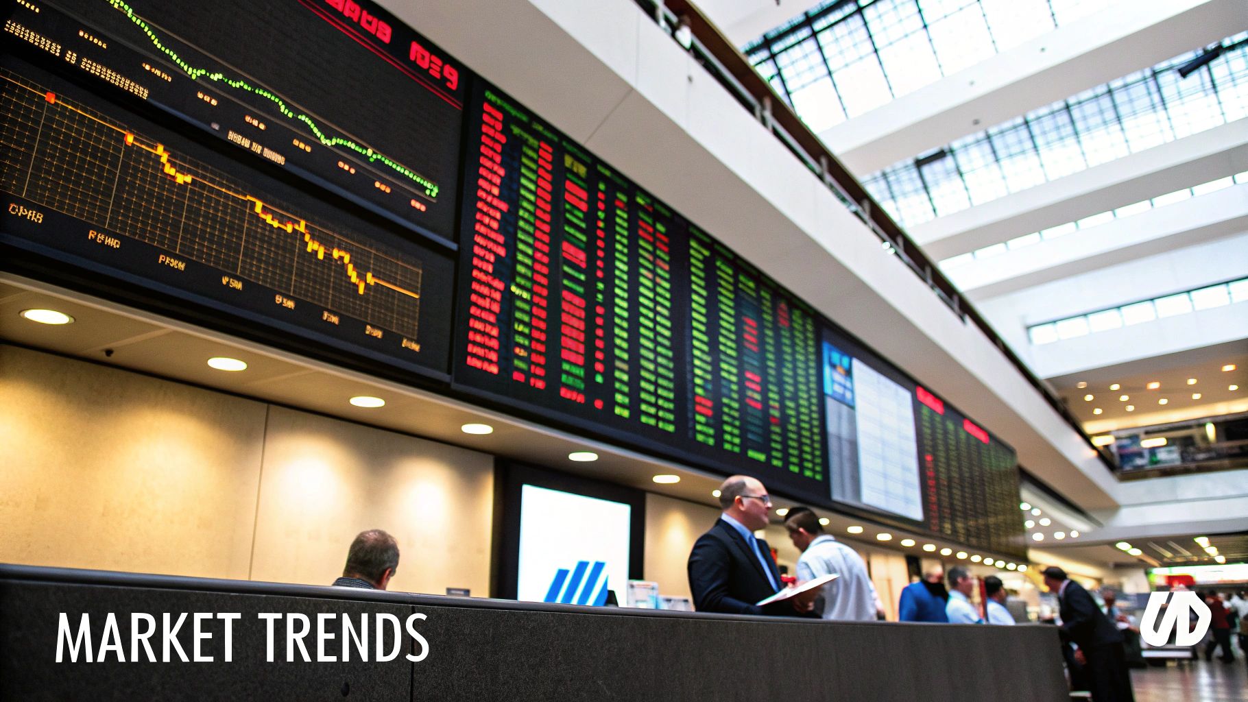
Take a look at a standard stock market ticker, for example. It's packed with the building blocks of historical data.
This image highlights the critical data points—like the last price, the day's change, and the bid/ask spread—that all feed into the historical record of a stock.
How to Read Stock Price Data
Jumping into a stock chart for the first time can feel like trying to read a foreign language. You're hit with a wall of numbers, abbreviations, and colorful bars that tell a detailed story—but only if you know how to translate them.
Fortunately, it’s simpler than it looks. Think of it as learning the basic vocabulary of the market. Once you grasp a few key terms, the entire picture starts to make sense, giving you the confidence to move from confusion to real analysis.
The Core OHLC Data Points
At the heart of any daily stock summary are four critical numbers known as OHLC: Open, High, Low, and Close. Together, they create a perfect snapshot of a stock's trading day, from the opening bell to the final moments.
- Open: The very first price a stock traded at when the market opened.
- High: The highest price the stock reached at any point during the session.
- Low: The lowest price the stock dropped to during the day.
- Close: The final price at which the stock traded when the market closed. This is the number you'll hear most often in financial news.
These four figures give you a quick, concise summary of the day's price action and volatility. A huge gap between the high and low, for instance, signals a day of wild price swings and tells you investors were pretty indecisive.
Measuring Investor Enthusiasm with Volume
Price alone doesn't tell the whole story. To really understand the conviction behind a price move, you need to look at Volume. This is simply the total number of shares that changed hands during a specific period, usually a single day.
Imagine volume as the crowd size at a concert. A massive price jump on very low volume is like a band getting a standing ovation from a nearly empty room—it’s just not that meaningful. But a price move on high volume? That suggests strong participation and belief from a huge number of investors.
High volume is what confirms a trend. When a stock rises on increasing volume, it signals powerful buying interest. On the flip side, a price drop on high volume indicates significant selling pressure.
Understanding the True Price with Adjusted Close
Sometimes, a company’s actions—like a stock split or a dividend payment—can make historical prices misleading. This is where the Adjusted Close comes in. It modifies a stock's closing price to smooth out these corporate actions, giving you a much truer picture of its performance over time.
Think of it like adjusting a recipe. If you double the ingredients to make a larger cake, you'd adjust the original recipe so you could accurately recreate it later. The adjusted close does the same thing for stock prices, ensuring that when you compare prices across different time periods, you're comparing apples to apples.
Using this metric is absolutely essential for any meaningful long-term analysis. These data points also feed into broader market sentiment indicators, and you can see how they all connect by understanding the Stocks Fear and Greed Index.
Here's a quick reference guide to help you remember these essential data points.
Key Components of Historical Stock Data
This table breaks down the must-know terms you'll encounter on any stock chart.
| Data Point | What It Represents | Why It's Important for Investors |
|---|---|---|
| Open | The first trade price of the day. | Sets the tone for the trading session. |
| High | The highest price reached during the day. | Shows the peak level of buying interest. |
| Low | The lowest price reached during the day. | Indicates the peak level of selling pressure. |
| Close | The last trade price of the day. | Often used as the benchmark for a stock's daily performance. |
| Volume | The total number of shares traded. | Measures the strength or weakness of a price move. |
| Adjusted Close | The closing price modified for splits/dividends. | Provides an accurate historical performance comparison. |
Getting comfortable with these core components is the first step toward reading the market's story. Once you can spot them on a chart, you're well on your way.
Where to Find Reliable Stock Data
Once you've got a handle on reading historical prices, the next logical question is: where do you find the good stuff? Thankfully, we're living in an age where high-quality stock data is everywhere, and a lot of it is free.
The trick isn't just finding data, but finding the right data source for what you’re trying to do, whether it's a five-second price check or a deep-dive analysis.
For most of us, the free, powerhouse platforms are more than enough to get started. You can get an incredible amount of information without spending a dime.
- Yahoo! Finance: This is the old guard for a reason. It’s a favorite among investors for its deep well of historical data, often stretching back decades. The interface is straightforward, and you can easily download charts and data tables to play with offline.
- Google Finance: With its clean, modern feel, Google Finance is fantastic for integrating real-time prices with the latest news. Its charts are super intuitive—you can flip between timeframes and layer multiple stocks on a single graph without any hassle.
Honestly, these two are often all you need for tracking major trends and researching companies.
Specialized and Brokerage Platforms
But what if you need to go deeper? That's when you might look at specialized providers or just use the tools already baked into your brokerage account. Some data providers offer incredibly granular datasets, even spanning over a century, which is gold for serious academic or technical research.
Your own brokerage account is another fantastic—and often overlooked—source. Platforms from brokers like Fidelity, Charles Schwab, or E*TRADE build historical price data right into their trading tools. This is a game-changer for convenience, letting you research a stock and place a trade all in the same window.
The real magic of using your brokerage platform is the seamless flow from research to action. You can spot a pattern in a stock's history and act on it immediately. For active traders, that's a huge advantage.
At the end of the day, the "best" source is the one that fits your workflow. For everyday research, Yahoo! Finance and Google Finance are hard to beat. For more advanced analysis, check out what your broker offers. The goal is to find a platform that feels right and gives you the details you need to invest with confidence.
Analyzing Historical Data for Market Insights
Having a clean set of historical stock prices is like getting all the ingredients for a great meal. Now, it's time to start cooking. This is where you turn raw numbers into actionable market insights, shifting from just reading data to actively interpreting it.
With a few basic analysis techniques under your belt, you can look at any price chart and start seeing the story unfold—the opportunities, the patterns, and the potential risks. The goal is to build a starter toolkit for making much smarter decisions.
Identifying Key Trends and Patterns
The very first step is to figure out the stock's general direction, what we call its trend. Is it climbing (an uptrend), falling (a downtrend), or just moving sideways? A simple way to see this is to draw a line connecting the major peaks or troughs on the chart.
This bird's-eye view gives you a sense of the stock's long-term momentum. A steady uptrend over several years, for example, usually points to a company with solid fundamentals. A long, grinding downtrend, on the other hand, might signal some serious underlying problems.
Seeing the big picture is essential. If you look at the DJIA over a 100-year timeline, you'll see an incredible story of growth. Even after adjusting for inflation, the long-term trend is undeniably up, proving how stocks have historically built wealth despite wars, recessions, and crises.
This chart shows how different pieces of the puzzle—trend lines, price moves, and moving averages—fit together to help you understand a stock's past.
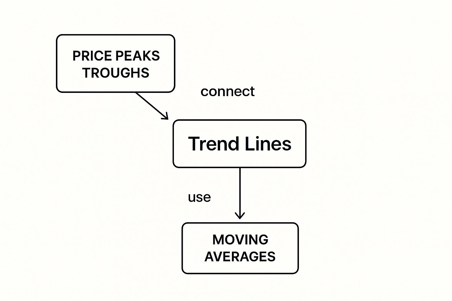
As the visual shows, identifying the main trend is the core of your analysis. It’s shaped by the stock's highs and lows, and indicators like moving averages help smooth out the noise to make that trend clearer.
Spotting Support and Resistance Levels
Look closely at any trend, and you'll notice specific price points where the stock seems to hit an invisible wall or find a safety net. We call these support and resistance levels.
- Support: Think of this as a price "floor." It’s a point where buyers tend to step in, stopping a downtrend in its tracks or even causing it to reverse.
- Resistance: This acts like a price "ceiling." It’s where sellers usually take over, putting a halt to an uptrend as buying interest fades.
Pinpointing these levels is incredibly powerful. They can act as smart entry or exit points and help you set realistic price targets or place stop-loss orders to keep your risk in check. When a stock finally smashes through a long-held resistance level, it’s often a very strong bullish signal.
Using Simple Technical Indicators
To see past the day-to-day chatter of price swings, traders use technical indicators. One of the most straightforward and popular is the Moving Average (MA). An MA simply smooths out price data by creating a constantly updated average price over a set period, like 50 days or 200 days.
When a stock's price climbs above its moving average, it can be a sign that a new uptrend is kicking off. And when it dips below, it might be signaling the start of a downtrend. These indicators give you objective signals that back up what you're seeing in the overall trend.
Combining these techniques with broader market sentiment gives you an even more powerful perspective. To take that next step, check out our guide on how to use market sentiment analysis for trading and see how you can layer emotional indicators into your technical approach.
A Case Study in Long-Term Market Resilience
Theory is one thing, but seeing how historical stock prices play out in the real world is what really makes the lessons stick. Let's bring these ideas to life by looking at the journey of the Dow Jones Industrial Average (DJIA), one of the oldest and most-watched stock market indexes on the planet.
This isn't just about crunching numbers; it's a story about resilience. By digging into how the DJIA navigated one of its most turbulent decades—the 1980s—we can see how major market shocks often shrink in significance when you zoom out. That historical context is crucial for building the confidence you need to face today's market uncertainty.
The Tumultuous 1980s: A Decade of Shocks
The 1980s were anything but calm. The decade was rattled by a nasty recession, an oil glut, the collapse of the junk bond market, and a constant drumbeat of geopolitical tension.
But the most infamous event of all was "Black Monday" on October 19, 1987.
On that single, brutal day, the DJIA plummeted by a jaw-dropping 22.61%—the largest one-day percentage drop in its history. For anyone invested at the time, it felt like a financial apocalypse. Panic spread like wildfire, and there was genuine fear of another Great Depression. Historical price charts from that day show a vertical drop that seemed to have no bottom.
This is exactly the kind of dramatic, short-term crisis that spooks investors into making emotional, often regrettable, decisions. But what does the full story of the decade show us?
Despite the gut-wrenching volatility of Black Monday and other crises, the 1980s ultimately tell a story of incredible growth. It’s a powerful reminder that short-term fear rarely aligns with long-term reality.
A Bigger Picture Perspective
When you pull back and look at the entire decade, the Black Monday crash starts to look less like a catastrophe and more like a dramatic but temporary blip on the radar. The data tells a surprising story of strength.
Even with that extreme volatility, the Dow still managed to climb by an impressive 228% throughout the 1980s. It kicked off the decade around 838 points and closed it out at 2,753 points, delivering positive returns in eight out of the ten years.
This remarkable growth happened despite all those economic headwinds, perfectly illustrating the stock market's inherent resilience over time. You can explore more about the DJIA's historical performance on Wikipedia.
This case study drives home a core lesson for every investor: perspective is everything. While scary, short-term events can feel all-consuming, a long-term view grounded in data often reveals a consistent upward trajectory. By learning from the market's past, we can navigate its future with a much steadier hand.
Putting It All Together: From Data to Decision
Learning to read historical stock prices is like learning to read a map. It turns you from a passenger in the market into an informed navigator. We've looked at this data not as a dusty old record book, but as a company's financial story—a tale filled with its wins, its losses, and its ability to bounce back. When you understand that story, you're holding the tools to navigate what comes next.
The real takeaway here is about making smarter, calmer decisions. Historical data isn't a crystal ball. It won’t tell you exactly what’s going to happen tomorrow. But it does give you a powerful framework for acting rationally instead of emotionally. It helps you spot patterns, get a real feel for risk, and truly appreciate why playing the long game often wins.
When you start layering this kind of technical analysis with an understanding of market psychology, your insights get even sharper. For a deeper dive, our guide to stock market sentiment analysis can add that critical human element to your strategy.
In the end, historical stock prices provide the context you need to build an investment plan that can actually last. They teach you that while markets will always be unpredictable, solid analysis and a little patience are advantages that never go out of style.
By putting these ideas into practice, you’re turning basic information into a genuine strategic edge. You’ll be ready to face whatever the market throws at you with clarity and confidence.
Frequently Asked Questions
When you start digging into historical stock prices, a few practical questions always pop up. Let's clear the air on some of the most common ones so you can get back to analyzing the data with confidence.
How Far Back Does Historical Stock Price Data Go?
It really depends on the company. For old-timers like the Dow Jones Industrial Average, you can find data stretching back over 100 years. It's a goldmine for understanding long-term market cycles.
But for a newer company, the data trail only starts at its IPO date. Most free platforms like Yahoo! Finance offer decades of data, which is more than enough for almost any analysis you'd need to do.
Is It Better to Use Adjusted or Unadjusted Prices?
For any analysis looking back more than a few months, you should almost always use the adjusted close price. No question about it.
Unadjusted prices are raw, daily snapshots. They don't account for things like stock splits or dividends, which can create huge, misleading drops in a price chart that look like a crash but aren't.
Using unadjusted data for long-term trend analysis is like trying to measure a growing child without accounting for their growth spurts. The adjusted close price smooths out these corporate actions, giving you a true and accurate picture of an asset's performance over time.
Think of it this way: the adjusted price tells the real, coherent story of an investment's journey.
Can Historical Prices Truly Predict Future Performance?
No, they can't predict the future with 100% certainty. That classic disclaimer, "past performance is not indicative of future results," is one of the most honest phrases in finance. Markets are messy and get hit by all sorts of unpredictable events, from economic shocks to sudden political news.
But that absolutely does not make historical data useless. It's a tool for understanding probabilities, not for gazing into a crystal ball.
By analyzing past trends, you can see how a stock has behaved under different market conditions. This helps you build a strategy, manage risk, and make much more informed decisions. It's about preparing for the future, not predicting it.
Ready to see how real-time market sentiment is shaping prices right now? The Fear Greed Tracker gives you live Fear & Greed scores for over 50,000 assets, adding a dynamic layer to your analysis. Explore live market sentiment today.