
The inverted head and shoulders pattern is one of those classic chart formations that gets traders talking. At its core, it's a powerful signal that a downtrend might be running out of steam, paving the way for a new uptrend. It tells a story of sellers losing their grip and buyers starting to take over.
What is an Inverted Head and Shoulders Pattern?

Looking at a stock chart can sometimes feel like trying to decipher an ancient language. All those lines, bars, and wicks can be more confusing than helpful. But what if the chart could tell you a story? A clear narrative of a market shifting from pessimism back to optimism? That's exactly what the inverted head and shoulders pattern does.
Think of it as the final scene in a long bear market drama. It’s a visual tug-of-war between sellers and buyers happening right at the bottom. The sellers make one last, desperate push to drive the price to a new low (the head), but they just don't have the strength to keep it there. Buyers then step in with more confidence, preventing the next dip from falling as far (the right shoulder).
This battle creates one of the most reliable bullish reversal signals out there. It’s not just some random shape on a chart; it’s a picture of the psychological shift happening behind the scenes as momentum flips from bearish to bullish.
The Bottom Line: This pattern isn’t just a technical formation. It represents seller exhaustion after a long downtrend and gives us the first real sign that buyers are finally wrestling back control.
The Story the Chart Is Telling
The inverted head and shoulders pattern is so compelling because it lays out a clear struggle for market dominance. Each part of the pattern plays a crucial role in telling this story.
Let's break down the key components and what they mean in plain English.
Inverted Head and Shoulders Pattern At a Glance
Here’s a quick overview of the pattern's core components and their market significance.
| Component | What It Looks Like | What It Means |
|---|---|---|
| Downtrend | A series of lower lows and lower highs. | The stage is set. This pattern only matters if it appears after a significant price decline. |
| Left Shoulder | The first major low in the formation. | Sellers are still in control, pushing the price down, but buyers start to show some initial interest. |
| Head | The lowest point of the entire pattern. | This is the point of maximum pessimism. Sellers give it one last shot but ultimately fail to sustain the low. |
| Right Shoulder | A higher low, roughly symmetrical to the left shoulder. | A crucial sign of strength. Buyers step in earlier, showing they're gaining confidence and sellers are losing steam. |
| Neckline | A resistance line connecting the peaks between the shoulders and the head. | The final hurdle. A decisive breakout above this line is the confirmation that the bulls have won and a new uptrend is likely underway. |
Each piece builds on the last, creating a narrative that’s easy to follow once you know what to look for.
Learning to spot this formation helps you shift from just reacting to price moves to actually anticipating them. It turns a messy chart into an actionable trading opportunity, giving you a clear roadmap for potential entry points, stop-losses, and profit targets. In this guide, we'll dive deep into how to identify and trade this pattern like a pro.
The Anatomy of the Reversal Pattern
To trade the inverted head and shoulders pattern with any confidence, you first need to understand its anatomy inside and out. This isn't just a random shape on a chart; it’s a story of market psychology shifting right before your eyes, with each piece playing a critical role. When you break it down, you can see exactly how a downtrend runs out of steam and a new uptrend starts to put down roots.
The pattern is defined by three distinct lows. The middle one (the head) is the lowest point, and it's flanked by two slightly higher lows (the shoulders). This structure is a classic sign of seller exhaustion. It’s a powerful signal that the balance of supply and demand is shifting, paving the way for a potential bullish reversal.
The Foundation: A Clear Downtrend
Before this pattern can even think about forming, one thing is non-negotiable: there has to be an established downtrend. The inverted head and shoulders is a reversal pattern, which means it needs something to reverse. This context is everything—it tells us that sellers have been in charge, pushing prices lower and lower.
Without a preceding downtrend, the formation is basically meaningless. Think of it like a dam built in a dry riverbed. It might look impressive, but it has no real function until the water shows up. That downtrend provides the selling pressure that eventually gets exhausted, setting the stage for the bulls to finally take over.
The Three Troughs: The Shoulders and Head
Once the downtrend is in place, the core of the pattern starts to take shape with three troughs in a row. Each one tells a part of the reversal story.
- The Left Shoulder: This is the first major low. Sellers push the price down, but for the first time, buyers show some real signs of life, triggering a small rally. It's the first clue that a support level might be forming.
- The Head: Sellers give it one last, aggressive shot, driving the price to the absolute lowest point in the formation. This is the moment of maximum bearishness. But the key here is that they can't hold it down there—a huge red flag for the downtrend.
- The Right Shoulder: After the head, the price rallies again, then dips one more time. Critically, this final low is higher than the head, and it often mirrors the left shoulder's depth. This is a massive signal that buyers are getting stronger and stepping in much earlier than before.
This visual map shows how all these moving parts come together.
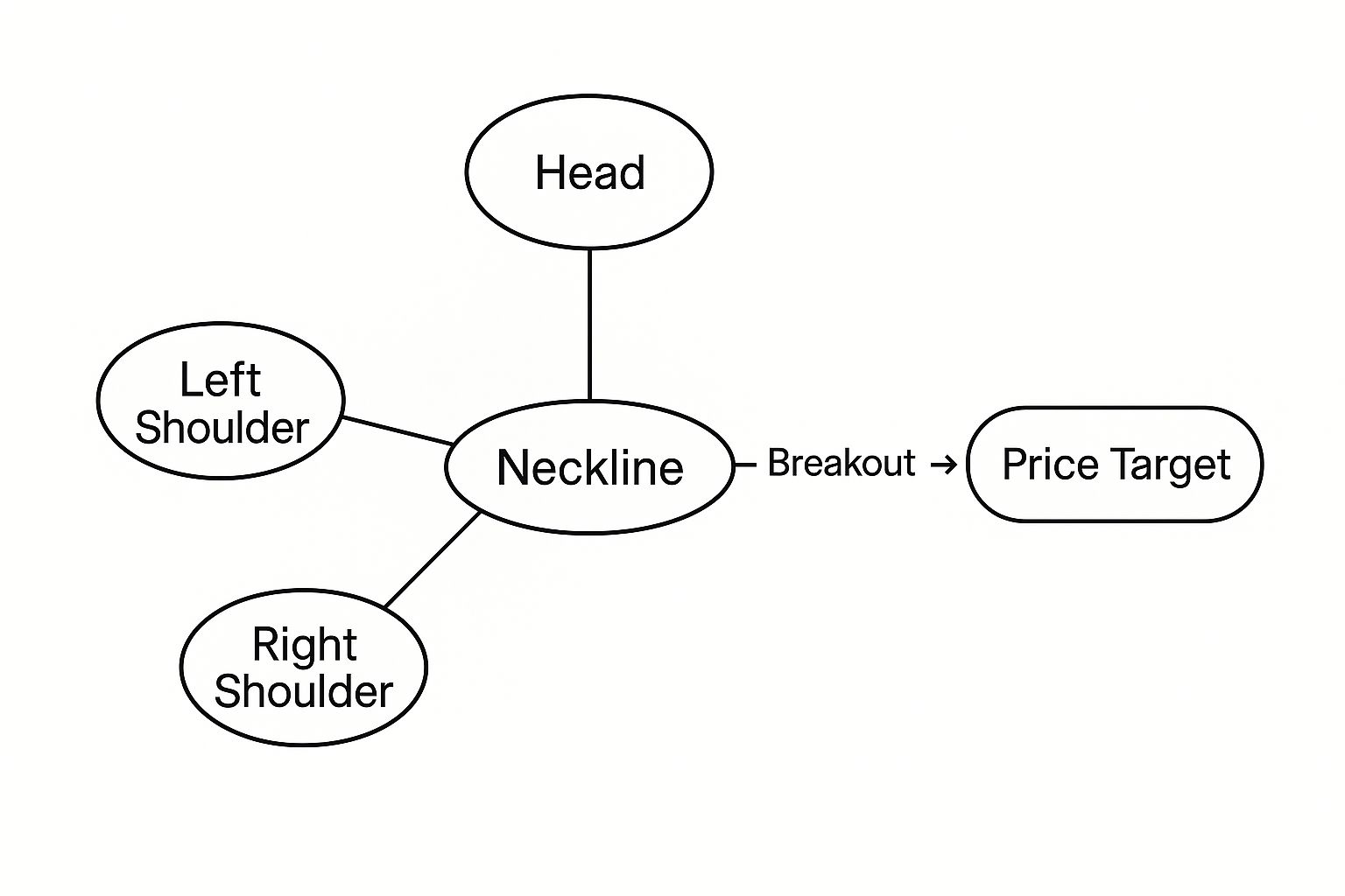
The chart lays it all out: the relationship between the shoulders, head, neckline, and the breakout that signals the start of a new move up.
The Neckline: The Line in the Sand
Now for the single most important part of the entire pattern: the neckline. This is a simple resistance line drawn by connecting the peaks that form between the left shoulder and the head, and between the head and the right shoulder.
Think of the neckline as a ceiling. The price has already bounced off it twice and failed to break through. A decisive move above this line is the confirmation—the proof that bulls have finally smashed through resistance and are now in control.
The slope of the neckline can also offer some subtle clues. A neckline that slopes slightly upward is usually seen as more bullish. A downward-sloping one, on the other hand, can suggest a weaker, less reliable reversal. Digging into how to read candlestick patterns can give you a much better feel for the price action happening around this critical level. For many traders, the breakout above this line is the only trigger that matters.
How to Trade the Breakout and Set Price Targets
Spotting the inverted head and shoulders is one thing, but actually making money from it? That's a whole different game. A profitable trade isn't just about identifying the pattern; it's about having a rock-solid plan for your entry, your exit, and how you’ll manage risk if things go sideways.

The entire trade really boils down to one make-or-break moment: the breakout. This is when the price punches through the neckline and closes above it, giving a clear signal that the buyers are finally in control. But how you play this moment depends on your appetite for risk.
Choosing Your Entry Strategy
Your entry style says a lot about your trading personality. Are you aggressive, willing to jump in early? Or are you more conservative, preferring to wait for that extra bit of confirmation?
The Aggressive Entry: This one’s simple. You enter a long position the second the price breaks and closes above the neckline. The upside? You get in at the ground floor and can potentially ride the entire move up. The downside, of course, is the risk of a false breakout—where the price pokes its head above the line only to get smacked back down.
The Conservative Entry: This approach takes a little more patience. After the initial breakout, you wait for the price to pull back and retest the old neckline, which should now act as a new floor of support. If the price bounces off that retest, that's your signal to enter. It offers much stronger confirmation, but you might miss the first leg of the rally.
No matter which entry you pick, there’s one thing you absolutely must see: volume. A real breakout is always powered by a big spike in trading volume. It’s the market’s way of saying, "We mean it this time."
Calculating Price Targets
Once you're in the trade, you need a goal. Where are you getting out? Luckily, the inverted head and shoulders pattern gives us a classic, no-nonsense way to figure this out.
- Measure the Height: First, calculate the vertical distance from the bottom of the head straight up to the neckline.
- Project Upward: Now, take that exact distance and add it to the breakout point on the neckline. That level is your minimum price target.
So, if the head bottoms out at $90 and the neckline is at $100, the pattern's height is $10. Your price target becomes $110 ($100 breakout + $10 height). Simple, clean, and data-driven.
And it’s not just theory—this method works. Research has shown that in about 74% of cases, the price actually hits its projected target after breaking the neckline. The same study found that 97% of breakouts continue to push higher, reinforcing just how reliable this pattern can be.
Setting Your Stop-Loss
Last but definitely not least, you have to protect your capital. A stop-loss is your safety net if the pattern fails.
The most logical place to put it is just below the low of the right shoulder. This gives the trade enough breathing room to move without getting stopped out by normal volatility, but it gets you out with a small, manageable loss if the bullish setup completely falls apart.
For a deeper dive into managing your risk, check out our guide on how to set stop-losses in this practical trader's guide.
Confirming the Pattern and Avoiding False Signals

Here's a hard truth: not every chart formation that looks like an inverted head and shoulders pattern is a real trading opportunity. Many are just noise—traps that can lead to some painful losses.
The real skill is learning to separate the high-probability signals from the fakes. You need a solid confirmation checklist.
Think of yourself as a detective building a case. The pattern is a strong piece of evidence, but it’s not enough to convict. You need more proof that the sellers are exhausted and the buyers are finally ready to take control. This means looking beyond the pattern's shape and digging into the market's context.
The Role of Volume as a Lie Detector
Volume is probably the most honest indicator you have. It's the market's lie detector, showing you the real conviction behind a price move.
A textbook inverted head and shoulders pattern tells a specific story with its volume. You'll often see higher volume during the sell-off that forms the left shoulder. Then, as the head and right shoulder take shape, volume tends to die down, which is a great sign that selling pressure is fading.
But the moment of truth is the breakout.
A breakout above the neckline on weak, pathetic volume is a massive red flag. A real, sustainable reversal is almost always powered by a huge spike in volume. It's the market screaming that buyers are back with a vengeance.
Using Confluence to Strengthen Your Case
Relying on a single pattern, no matter how good it looks, is a rookie mistake. The pros look for confluence—that sweet spot where multiple, independent indicators all point to the same conclusion. It's about building a layered argument for your trade.
By layering other technical tools over the chart, you can see if they support the bullish reversal story. It’s like getting a second and third opinion before making a big decision.
Confirmation Checklist:
- Bullish Divergence: Fire up an oscillator like the Relative Strength Index (RSI). If the price makes a lower low (the bottom of the head) while the RSI makes a higher low, that's bullish divergence. It’s a classic sign that the downward momentum is running out of gas.
- Moving Average Crossovers: Keep an eye on your moving averages. A bullish signal is when a short-term average (like the 20-period) crosses up and over a longer-term one (like the 50-period) right around the breakout. This confirms a shift in momentum.
- Market Sentiment: A great pattern is even more powerful when it aligns with the overall market mood. Is the broader market feeling more optimistic? Understanding how to use sentiment analysis for stocks can help you read the market mood and add another layer of confirmation.
By demanding this extra evidence—a clear volume signature and a thumbs-up from other indicators—you stop being a pattern-spotter and start becoming a trader who makes well-supported decisions. This discipline is what separates the consistently profitable from those who get fooled by every false signal.
Understanding the Pattern’s Statistical Edge

It's one thing to spot a pattern on a chart, but it's another to know if you can actually trust it. So, how reliable is the inverted head and shoulders pattern when the rubber meets the road? Let's dig into the numbers, because that's what separates strategic trading from just hopeful guessing.
No chart pattern works 100% of the time. But this one is widely seen as one of the most dependable signs of a bullish reversal. Knowing the statistics behind it gives you a real edge and helps you set expectations that are grounded in reality, not hype.
Analyzing Historical Success Rates
Data gives us a huge advantage. By looking at how this pattern has behaved in the past, we can get a much clearer picture of what to expect after a breakout. The numbers show a strong tendency for the price to keep rising, but they also reveal a few common hiccups that can trip up traders who aren't prepared.
Research from sources like TradingView has found a stunning success rate. In roughly 98% of cases, the price breaks out bullishly after completing the pattern. That’s an incredibly high probability for a directional move.
But the real test is whether the pattern delivers on its full promise.
Reaching Price Targets and Handling Pullbacks
Seeing a breakout is exciting, but the next question is always: will the price actually hit my target? This is where the statistics get really interesting.
While the breakout itself is highly reliable, the follow-through is where you need to manage your expectations. About 63% of these patterns see the price meet or exceed the minimum calculated price target.
That’s still a solid majority, giving you a good shot at taking profits. It also tells us that while the direction is usually right, the strength of the move can vary. This is exactly why disciplined risk management is non-negotiable.
Another key piece of data to keep in your back pocket is how often pullbacks happen. A pullback is when the price breaks out, only to drop back down to test the old neckline (now acting as support) before continuing higher.
- Pullback Frequency: This happens in about 45% of breakouts.
- Why It Matters: Knowing this stat can keep you from panic-selling. A pullback is often a healthy sign of confirmation, not a red flag signaling a failed pattern.
- Trading Implication: More conservative traders often wait for this retest to enter a trade. It can offer a better entry price and a tighter stop-loss, improving the risk-reward setup.
By understanding these probabilities, you can build a much smarter, more resilient trading plan. You learn to trust the strength of the inverted head and shoulders while respecting its limits. It’s this data-backed approach that lets you trade with confidence, not emotion—and that’s a massive advantage in any market.
Even a rock-solid pattern like the inverted head and shoulders can burn you if you don't trade it with discipline. The quickest way to get ahead is to learn the common pitfalls other traders fall into so you can sidestep them. More often than not, it's emotion or impatience that turns a high-probability setup into a frustrating loss.
The most common mistake? Jumping the gun. Traders see the right shoulder taking shape, and the fear of missing out kicks in. They enter the trade before the price has actually broken and closed above the neckline. This is a rookie move—trading what you think will happen, not what the chart is telling you.
Solution: Patience is your best friend here. Think of the neckline as a locked door. You don't get in until the price smashes through it with a key—a strong candle close on high volume. This confirmation is your filter, and it weeds out a ton of fakeouts.
Another classic error is completely ignoring volume. A breakout on weak, anemic volume is a huge red flag. It’s a trap. It shows there's no real conviction from buyers, and the odds are high that the move will fizzle out and reverse.
Setting Unrealistic Expectations
It’s easy to get swept up in the excitement of a potential reversal, but that's when risk management goes out the window. This is where traders usually mess up in two specific ways.
- Drawing a Sloppy Neckline: When a chart looks messy, it's tempting to draw the neckline wherever it's convenient to confirm what you want to see. But an inaccurate neckline means a false breakout signal and a poorly timed entry. Fix: Be brutally objective. Connect the exact highs between the shoulders and the head. If the line isn't clean and obvious, the pattern probably isn't valid. Just walk away.
- Setting a Stop-Loss Too Tight: Trying to keep potential losses tiny, some traders will stick their stop-loss just a few ticks below their entry point. This gives the trade zero breathing room. Normal market noise or a minor pullback can easily knock them out of a perfectly good position right before it takes off. Fix: Give your trade some space. Place your stop-loss below a logical support level, which is usually the low of the right shoulder.
Common Questions Answered
What's the Difference Between This and a Regular Head and Shoulders Pattern?
Think of them as mirror images with opposite jobs. The regular head and shoulders pattern is a bearish signal that shows up at the top of an uptrend, warning that a rally might be over.
The inverted head and shoulders, on the other hand, is its bullish twin. You'll spot it at the bottom of a downtrend, and it’s a powerful sign that the sellers have run out of steam and the buyers are gearing up to take over.
Does This Pattern Work on All Timeframes?
Absolutely. You can find this pattern on everything from a 5-minute intraday chart to a long-term weekly or monthly chart.
But here’s a pro tip: the longer the timeframe, the more weight the pattern carries. A massive inverted head and shoulders that forms over several months is usually a much more reliable signal and often kicks off a more powerful and sustained move once the breakout happens.
What If the Price Breaks the Neckline but Then Flips Back Down?
That’s what traders call a "false breakout," and it’s a classic trap. When the price pokes above the neckline but can't hold its ground, it’s a major red flag.
This failed pattern tells you the buyers didn't have enough conviction to push the price higher. Instead of a bullish reversal, it often becomes a bearish signal, suggesting the downtrend is likely to continue.
Stop relying on guesswork. Track market sentiment in real-time with Fear Greed Tracker and make smarter, data-driven trading decisions. Get your edge today.