
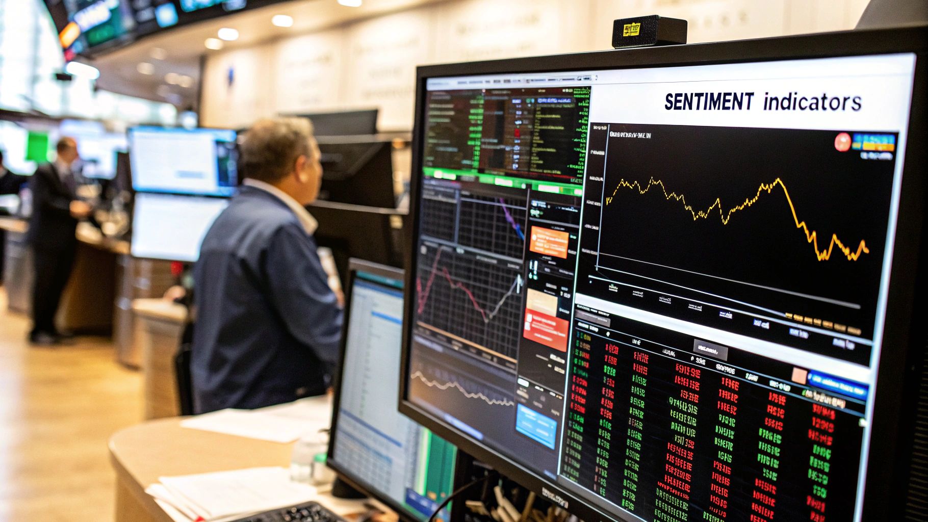
Think of the stock market as a giant crowd. Some days, everyone's buzzing with excitement, wildly optimistic about the future. On other days, a wave of fear washes over them, and panic sets in. Stock market sentiment indicators are the tools we use to get a read on this crowd's collective mood, giving us an almost psychological x-ray to see what’s really going on.
They're designed to measure whether extreme greed or paralyzing fear is in the driver's seat.
Understanding the Market's Emotional State
At the end of the day, the market is just people. People making decisions based on numbers, charts, and—whether they admit it or not—emotions. While you have fundamental analysis digging into a company's books and technical analysis looking at price patterns, sentiment analysis zeroes in on that human element. It tries to put a number on the collective optimism or pessimism floating around.
Here’s a practical way to think about it: imagine a stock with a perfect balance sheet and a chart that’s screaming "uptrend." But what if every single investor is already bullish and has bought in? Who's left to push the price higher? This is exactly where sentiment analysis proves its worth. It adds crucial context to the numbers and charts.
The core idea behind using sentiment indicators is often contrarian. When the crowd is overwhelmingly fearful, it can signal a fantastic buying opportunity. On the flip side, when everyone is euphoric and greedy, it might be time to get cautious.
Why Sentiment Matters in Your Strategy
Trading without paying attention to the market’s mood is like setting sail without a weather forecast. You can have the best boat and a perfect map, but an unexpected storm—or even a period of dead calm—can completely derail your trip. Stock market sentiment indicators are that essential weather report for traders.
Weaving them into your strategy gives you a real edge:
- Identifying Market Extremes: They shine brightest when pointing out moments of "maximum pessimism" or "irrational exuberance," which often mark major turning points in the market.
- Providing Context: Sentiment data helps you understand the why behind a market move. Is a big rally fueled by solid economic growth, or is it just a speculative frenzy?
- Improving Risk Management: Knowing when the market is dangerously complacent or overly fearful lets you dial your own risk up or down, protecting your capital from sudden reversals.
Different Angles on Market Psychology
No single indicator can give you the full picture. That's why they're grouped into different categories, each measuring the market's mood from a slightly different angle. Some look at options data to see where big money is placing its bets, while others just survey investors directly to ask how they feel.
By combining these different viewpoints, you can piece together a much more reliable and complete picture of the prevailing attitude.
Ultimately, sentiment indicators aren't a crystal ball. They won't tell you exactly where a stock will be next Tuesday. But they are a powerful tool to use alongside other forms of analysis. To dig deeper into these core concepts, check out our complete trader's guide to stock market fear and greed. Learning to read the market's emotional pulse adds a vital dimension to your trading toolkit, helping you stay level-headed when everyone else is driven by panic or euphoria.
Of all the stock market sentiment indicators out there, none gets more airtime than the CBOE Volatility Index, better known as the VIX. You’ve probably heard it called the "fear gauge," a dramatic name for what's essentially a real-time snapshot of the market's anxiety. But what is it actually telling you?
At its core, the VIX is a forecast. It predicts how much the S&P 500 index will swing over the next 30 days. It’s not looking at past performance; it’s a forward-looking measure calculated from the prices of S&P 500 index options. Think of it like a weather report for market turbulence—it tells you whether traders are expecting clear skies or battening down the hatches for a storm.
Interpreting the VIX Numbers
Reading the VIX is more of an art than a hard science, but certain levels tell a pretty clear story. The number itself represents the expected annualized change in the S&P 500. For example, a VIX of 20 suggests traders anticipate the index moving up or down within a 20% range over the next year.
Here’s a simple way to break down the numbers:
- VIX Below 20: This is the calm zone. It usually signals low fear and even a bit of investor complacency. The market feels stable, and big price swings seem unlikely. But be careful—extremely low levels can be a contrarian sign that investors are getting a little too comfortable, which can sometimes precede a correction.
- VIX Between 20 and 30: Things are a bit more uncertain here. This range suggests a heightened sense of caution, but not full-blown panic. Markets might feel choppy as investors digest new economic data or react to geopolitical headlines.
- VIX Above 30: Welcome to the high-fear zone. A reading above 30 signals significant anxiety and uncertainty. Traders are actively buying protection (put options) to hedge against a potential market drop. For contrarian investors, these are the moments to pay attention to, as peak fear often coincides with market bottoms.
The CBOE provides real-time data, so you can watch these fluctuations unfold live.
This chart from the CBOE shows the VIX in action. With just a quick glance, you can get a feel for the market's current mood and see how it stacks up against recent history.
The VIX During Market Crises
The VIX really shows its teeth during periods of extreme market stress. While its historical average hovers around 20, major crises send it soaring.
During the 2008 financial crisis, the VIX shot past 80, reflecting absolute panic. More recently, on March 16, 2020, it hit an intraday high of 82.7 as the COVID-19 pandemic sent global markets into a meltdown. These spikes are a raw, unfiltered look at intense fear driving massive sell-offs. You can explore the historical movements of key market indicators on TradingEconomics.com.
Key Takeaway: The VIX and the stock market have an inverse relationship. When the S&P 500 drops sharply, the VIX tends to spike. When the market rallies, the VIX usually falls.
Limitations You Must Understand
For all its fame, the VIX isn't a crystal ball. A low VIX doesn't guarantee the good times will keep rolling. In fact, a market can stay in a low-volatility state for a long time, lulling investors into a false sense of security right before a sudden drop.
It’s also important to remember that the VIX is laser-focused on the S&P 500. It won’t tell you much about what’s happening in other asset classes, international markets, or with small-cap stocks.
So, while the VIX is an indispensable tool, it shouldn't be the only tool in your belt. Use it alongside other stock market sentiment indicators and solid fundamental analysis to get the full picture.
Using the Put-Call Ratio to Gauge Expectations
While the VIX gives us a read on expected volatility, the Put-Call Ratio (PCR) cuts right to the chase. It shows us what traders are actually betting on, right now. This powerful indicator digs into the options market to measure the real-time balance between bullish optimism and bearish fear.
To really get it, you first have to understand the two sides of the coin.
A call option is basically a bet that a stock or index is going up. When you buy a call, you get the right—but not the requirement—to buy an asset at a set price. It's a fundamentally optimistic move.
On the flip side, a put option is a bet that a stock or index is headed down. Buying a put gives you the right to sell at a predetermined price, making it a classic tool for hedging against a downturn or just flat-out betting on a price drop. It's an inherently pessimistic move.
Calculating and Interpreting the Ratio
The Put-Call Ratio is refreshingly straightforward. It’s calculated by dividing the total number of traded put options by the total number of traded call options over a set period.
Put-Call Ratio = Total Put Volume / Total Call Volume
The number that pops out tells a fascinating story about the market's mood.
- A High Ratio (e.g., above 1.0): This means more puts are being bought than calls. It suggests traders are getting nervous, hedging their portfolios, or actively betting on a decline. This is a clear sign of widespread bearish sentiment.
- A Low Ratio (e.g., below 0.7): When call volume starts outpacing put volume, the ratio drops. This signals that traders are feeling confident, expecting higher prices, and showing strong bullish sentiment.
- A Neutral Ratio (around 0.7 to 1.0): This middle ground typically means the market is more balanced or indecisive. Neither the bulls nor the bears have a clear upper hand.
The Power of Contrarian Thinking
Now, here’s where the Put-Call Ratio gets really interesting. While a high ratio signals fear, an extremely high ratio can be a powerful contrarian signal.
Think of it like a stretched rubber band. When fear gets so thick that put volume is overwhelming call volume, it often means pessimism has peaked and the market is oversold. That rubber band is stretched to its absolute limit, and a sharp snap-back rally could be just around the corner.
For a contrarian investor, extreme fear isn't a signal to sell—it's a potential buying opportunity. An unusually high Put-Call Ratio suggests most of the sellers have already bailed, leaving more room for buyers to step in and drive prices higher.
The same logic works in reverse. An exceptionally low ratio points to extreme optimism and greed. When practically everyone is bullish and loaded up on calls, it can signal that a market top is approaching because there’s very little "buying power" left to keep the rally going. That kind of complacency is often a warning sign of an impending downturn.
Differentiating Equity and Index Ratios
It’s absolutely critical to know which Put-Call Ratio you're looking at, because they tell very different stories.
- Equity Put-Call Ratio: This tracks options on individual stocks. Everyday investors and institutions often buy puts on specific stocks they own as a form of insurance, so this ratio naturally has a lower baseline. Extreme readings here can be very telling about speculative fervor or panic.
- Index Put-Call Ratio: This tracks options on major indices like the S&P 500. Large institutional fund managers constantly buy index puts to hedge their entire portfolios—it’s just standard-issue risk management. Because of this, the index PCR tends to run higher than the equity PCR on an average day.
By watching both, you get a much more nuanced picture. A spike in the equity ratio might signal true speculative fear, whereas a jump in the index ratio could just be institutions doing their routine hedging. Using the PCR effectively isn't just about reading the number; it's about understanding the context and spotting those extreme moments when the crowd’s bets become dangerously one-sided.
Analyzing What Investors Say vs. What They Do
To really get a feel for the market's mood, you have to look at two things: what investors say they believe, and what they’re actually doing with their money.
Sometimes, talk and action line up perfectly. Other times, they tell completely different stories. It's in that gap—the space between opinion and action—that you can find some of the most powerful clues about where the market is headed.
This approach gives you a complete 360-degree view. First, we’ll dive into surveys that simply ask investors how they feel. Then, we’ll look at the hard data showing where the money is actually flowing.
Listening to the Crowd with Investor Surveys
One of the most straightforward ways to gauge sentiment is to just ask people. That's exactly what investor surveys do—they give you a direct pulse on the collective mood. These polls capture the hopes and fears bubbling under the surface before they fully play out in the market.
The AAII (American Association of Individual Investors) Sentiment Survey is one of the most well-known. Since 1987, it has asked its members a simple question every week: what direction do you think the stock market is headed in the next six months? Answers are bucketed into bullish (prices up), bearish (prices down), or neutral.
As a contrarian, this data is gold. When an overwhelming number of investors are bullish, it can be a warning sign that the market is getting overheated and due for a pullback. On the flip side, when bearishness hits an extreme peak, it often means fear has gone too far, potentially creating a fantastic buying opportunity.
Key Insight: Investor surveys measure opinions, not actions. They tell you how people feel, which is a massive psychological driver. When those feelings hit an extreme—either greed or fear—it often signals the crowd has pushed things too far.
Following the Money with Margin Debt
While surveys tell you what investors say, margin debt shows you what they do. Margin debt is the total amount of money investors have borrowed from their brokers to buy stocks. It’s a direct measure of their willingness to take on risk.
Think of it as a confidence meter backed by cold, hard cash.
- Rising Margin Debt: When investors feel good about the market's direction, they borrow more to amplify their bets. A steady climb in margin debt usually happens during a healthy bull run, reflecting growing optimism.
- Falling Margin Debt: When that confidence evaporates, investors sell stocks to pay back their loans, and margin debt shrinks. A sharp drop is a retreat from risk and often happens right before or during a market correction as fear sets in.
Combining "Say vs. Do" for a Clearer Picture
The real magic happens when you layer these two types of indicators on top of each other. They act as a cross-check, helping you spot real signals and ignore the noise.
Let’s walk through a scenario:
- The AAII survey shows extreme bullishness. Almost everyone you ask expects stocks to keep screaming higher.
- At the same time, margin debt levels have just hit a new all-time high.
This combination paints a textbook picture of "irrational exuberance." Not only are people saying they’re wildly optimistic, but they're also backing it up by borrowing record amounts of money. This creates a very fragile market. A small dip could trigger a wave of forced selling as margin calls go out, turning a small retreat into a rout.
Now, imagine the opposite. The AAII survey shows extreme fear, but margin debt is stable or only dipping slightly. This might suggest that while individual investors are panicking, the big money isn't rushing for the exits just yet. The fear might be more contained than the survey alone would have you believe.
By comparing what investors are saying with where they’re actually putting their capital, you move beyond one-dimensional analysis. You get a much more reliable and actionable read on the true mood of the market.
Building a Complete Market Sentiment Dashboard
Trying to read the market with just one sentiment indicator is a fool's errand. It’s like navigating a new city using only the tallest skyscraper as your guide—you know where you are relative to that one point, but you have no feel for the traffic, the one-way streets, or the general vibe of the neighborhoods. To get the full picture, you need a dashboard that pulls together several different, unrelated data points.
The real magic happens when you find confluence. This is the sweet spot where different indicators, all measuring unique aspects of market psychology, start pointing in the same direction. When this happens, you can act with much more confidence, knowing you’re not just reacting to a single, potentially flaky signal.
Think about it like this:
- The Put-Call Ratio sinks to a multi-year low, showing traders are piling into bullish call options.
- At the same time, the VIX dips below 15, a clear sign of complacency.
- To top it off, you see that investor margin debt is skyrocketing to new all-time highs.
Any one of these on its own is a yellow flag. But all three flashing at once? That’s a crystal-clear, flashing red light warning of extreme greed and market froth. The confluence of these signals is exponentially more powerful than any one of them alone.
Combining Indicators for a Clearer View
The goal is to build your own personal dashboard that covers all the important bases: market volatility, options market activity, and overall investor positioning. When you cross-reference these different streams of data, you can confirm or reject your market thesis with a much higher degree of certainty.
Visualizing how these indicators stack up against each other is a great way to understand their strengths and weaknesses.
The chart below gives you a look at the predictive accuracy and success rates for several of the most popular indicators.
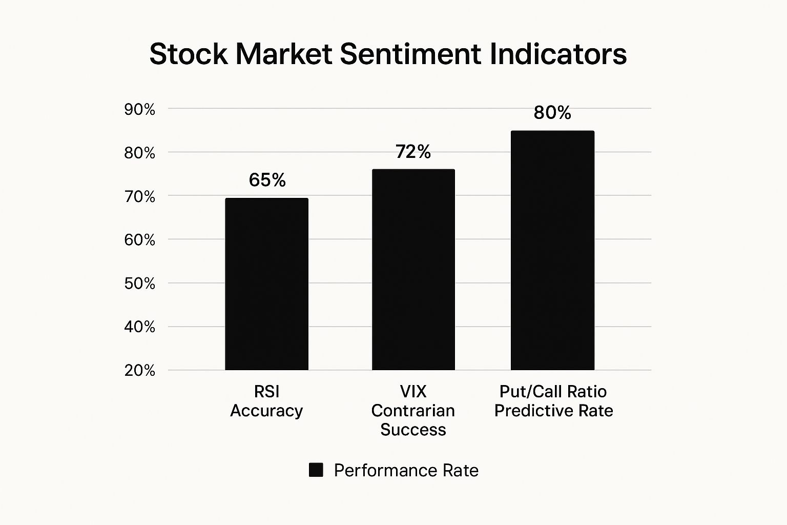
This image really drives home how you can strengthen your analysis by, for example, combining a contrarian VIX signal with the predictive power of other metrics.
To help you get a bird's-eye view, this table breaks down the core indicators we've discussed, making it easy to compare them at a glance.
Comparing Key Stock Market Sentiment Indicators
| Indicator | Type | What It Measures | High Reading Implies | Low Reading Implies |
|---|---|---|---|---|
| VIX | Volatility | Investor fear and uncertainty (forward-looking) | Extreme Fear | Complacency / Greed |
| Put-Call Ratio | Options-Based | The ratio of bearish bets (puts) to bullish bets (calls) | Extreme Fear | Extreme Greed |
| AAII Survey | Survey-Based | Individual investor outlook for the next 6 months | Extreme Greed | Extreme Fear |
| Margin Debt | Positioning | The amount of money borrowed to buy stocks | Extreme Greed | Fear / De-risking |
| Junk Bond Demand | Risk Appetite | Investor demand for high-risk corporate bonds | Greed / Risk-On | Fear / Risk-Off |
This side-by-side comparison highlights the unique role each indicator plays, helping you build a more balanced and complete view of market psychology.
Simplifying Analysis with Composite Tools
Building a dashboard from scratch is powerful, but let’s be honest—it can be a lot of work. That’s where composite indicators, like the popular CNN Fear & Greed Index, come into play. These tools do the heavy lifting by blending multiple sentiment indicators into a single, easy-to-digest score.
They typically mix together seven or more metrics, including:
- Market Momentum
- Stock Price Strength
- Put and Call Options
- Junk Bond Demand
- Market Volatility (the VIX)
This unified score gives you a quick, at-a-glance read on the market's emotional temperature, making it much simpler to spot when sentiment is reaching an extreme. Our guide on using market sentiment analysis for trading digs deeper into how to apply these tools in the real world.
Key Takeaway: A composite index is like a skilled orchestra conductor. It listens to each individual instrument—the VIX, the PCR, market momentum—and blends their sounds into one coherent piece of music. It turns a wall of noise into a clear signal.
Ultimately, you need a framework that works for you. Whether you build a custom dashboard or rely on a composite tool, the principle is the same. Always look for confirmation across different types of indicators to make smarter, more confident decisions backed by a complete view of market psychology. This multi-dimensional approach is what elevates your trading from reactive guesswork to strategic, sentiment-aware investing.
Common Pitfalls and Best Practices
Getting a handle on stock market sentiment indicators can feel like unlocking a new level in your trading game. But like any powerful tool, it’s easy to misuse them if you aren't careful. Knowing the common traps ahead of time is the best way to use this data smartly.
The biggest mistake I see traders make? Pinning all their hopes on a single indicator. Seeing a high VIX or a rock-bottom Put-Call Ratio and hitting the "buy" button is like trying to diagnose an illness from just one symptom. It’s a clue, sure, but it’s missing the bigger picture.
Another classic error is ignoring the wider economic landscape. Sentiment doesn't exist in a bubble. It's constantly being nudged by interest rates, inflation numbers, employment reports, and global events. A sudden spike in fear could be a knee-jerk overreaction or the first real warning sign of an economic storm. Without context, you’re just guessing.
Developing Your Best Practices
To sidestep these pitfalls, you need to build a disciplined framework. This isn't just about reading the numbers; it's about using them to shape a more thoughtful, nuanced strategy. The goal isn’t to predict the future with 100% accuracy, but to manage your risk and spot opportunities with a higher chance of success.
Here are a few core practices to get you started:
- Think Like a Contrarian: The real power of sentiment indicators is in spotting extremes. When everyone is terrified and indicators are flashing red, that's often the time to start looking for bargains. When greed is off the charts, it’s a signal to be more cautious.
- Always Get Confirmation: A sentiment signal should never be a solo act. Let it be the trigger that makes you dig into your other tools. Look for price action, chart patterns, or fundamental valuations that back up what the sentiment is telling you.
- Check the History: A single data point is just a number. Its real power comes from comparing it to its own history. A Put-Call Ratio of 1.0 might seem bearish on its own, but if its historical peak is 1.5, you know there's still plenty of room for fear to climb.
A Responsible Framework for Integration
The best traders I know use sentiment as one critical layer in their analysis—not as a crystal ball. They get that while emotions can hijack the market in the short term, fundamentals and economic reality always win out in the long run. If you want to go deeper, our guide on what market sentiment is and how to measure it offers some great additional insights.
Final Takeaway: Treat stock market sentiment indicators like a seasoned navigator's compass. It points you in the direction the herd is running, but it can’t tell you if they're stampeding towards a cliff or a lush, green pasture.
It’s your job to use that information along with your map (fundamental analysis) and your view of the immediate terrain (technical analysis) to pick your own path. Combine these tools, and you’ll be in a much better position to manage risk and turn the market’s emotional swings to your advantage.
Your Top Questions, Answered
When you first start digging into sentiment indicators, a few questions always pop up. Let's tackle them head-on, so you can sidestep the common mistakes and use these tools like a pro.
Which Sentiment Indicator Is the Most Reliable?
There isn't one. Thinking you can rely on a single indicator is one of the biggest traps you can fall into. The real magic happens when you use them together, like assembling a team of expert witnesses for a case.
The VIX might flash a warning sign of fear, but is that fear translating into action? The Put-Call Ratio can confirm if traders are actually putting their money where their mouth is and buying protection.
Relying on a single indicator is risky because it can give false signals. The strongest trading theses are built on a confluence of evidence—when multiple, unrelated indicators all point to the same conclusion of extreme fear or greed.
How Often Should I Check Sentiment Indicators?
This really boils down to your personal investing or trading style. There's no one-size-fits-all answer.
- Day Traders: You'll want to keep an eye on real-time indicators. Think of the VIX and intraday Put-Call Ratios, where sentiment can flip on a dime.
- Swing Traders: A daily check-in is probably enough. You'll likely put more weight on weekly trends from sources like the AAII Sentiment Survey to inform your multi-day or multi-week holds.
- Long-Term Investors: You can relax a bit. A monthly check-in is plenty to gauge the market's overall temperature. The goal is to see if euphoria is hitting dangerous levels, which might signal a bad time to deploy fresh cash.
Can Sentiment Indicators Predict Market Crashes?
No, they can't predict a crash with a crystal ball's certainty. What they can do is act as a barometer for market risk.
Think of it this way: when indicators scream extreme greed, complacency, and high leverage, it’s like seeing dry kindling and dead leaves piling up in a forest. It doesn't mean a fire is guaranteed to start, but it creates the perfect conditions for a small spark to become an inferno.
These indicators signal rising fragility. When sentiment is dangerously euphoric, any unexpected bad news is far more likely to trigger a brutal, fast-moving sell-off.
Are These Indicators Useful for Long-Term Investors?
Absolutely. While they're often seen as a short-term trader's toy, sentiment indicators offer huge value for those with a long-term horizon. Their main job is to help you sidestep your own worst behavioral instincts.
For instance, they can stop you from piling into the market right at the peak of a bubble, when everyone else is shouting from the rooftops.
By keeping an eye on sentiment, a long-term investor can spot moments of extreme fear as what they often are: a fantastic opportunity to buy great companies at a discount. On the flip side, they can recognize moments of irrational exuberance as a clear signal to be patient, hold off on new buys, and wait for much better entry points. Over time, that discipline can make a massive difference to your returns.
Ready to stop guessing and start measuring the market's mood? With real-time data on over 50,000 assets, Fear Greed Tracker gives you the tools to see what other traders feel. Transform fear and greed into your strategic advantage. Get started with Fear Greed Tracker today.