
Looking at a crypto chart for the first time can feel like trying to decipher an ancient script. But learning how to read crypto charts is really just about understanding the language of supply and demand. What you’re seeing is a visual story of price movements over a specific period, whether that’s minutes, hours, or even months.
Decoding Your First Crypto Chart
When you pull up a chart, it's easy to get overwhelmed by all the lines and colors. Don't sweat it. The first thing to do is get your bearings.
Look at the two main axes: the vertical Y-axis shows the asset's price, and the horizontal X-axis represents time. Every single shape on that grid is telling you something about the ongoing tug-of-war between buyers and sellers.
To make informed decisions, you need to interpret both price action and trading volume. For years, Bitcoin (BTC) was the undisputed king, at one point commanding roughly 58.86% of the entire crypto market share. Reading its chart usually means starting with candlestick patterns, which pack a ton of information into a small space. Below them, you'll see volume bars, which tell you how much conviction is behind a price move.
You can dig deeper into crypto market dynamics with Statista's detailed analysis.
Understanding the Main Chart Types
While there are a few ways to visualize price, you'll almost always run into these three. Each one offers a different level of detail.
- Line Chart: This is as simple as it gets. It just connects the closing prices over time with a single line. It's great for a quick, high-level glance at the overall trend without any noise.
- Bar Chart: This one gives you a bit more information. For each period, you get four key data points: the opening price, the closing price, and the high and low. It offers a much better feel for volatility.
- Candlestick Chart: This is the go-to for most traders, and for good reason. Like a bar chart, it shows the open, close, high, and low, but its format—with a thick "body" and thin "wicks"—makes spotting market sentiment incredibly intuitive.
For anyone new to trading, I'd say the candlestick chart is the single most valuable tool to master first. The visual cues it provides are just so much clearer than any other type.
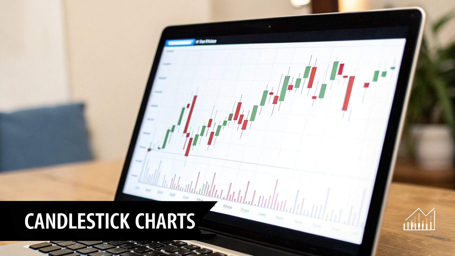
Here’s what a typical candlestick chart looks like on a platform such as TradingView.
This chart of Bitcoin’s price uses candlesticks to show what’s happening. The green and red candles instantly tell you whether the price moved up or down in a given period, while those bars at the bottom show you the trading volume.
Making Sense of Japanese Candlestick Patterns
If you've ever glanced at a financial chart, you've probably seen them: the little red and green bars that look like, well, candlesticks. They’re the go-to choice for traders because they pack a ton of information into a single shape, telling a rich story about the constant tug-of-war between buyers (bulls) and sellers (bears).
Learning to read candlesticks is like learning the language of the market. It’s a core skill that lets you feel the market’s pulse just by looking at a chart.
Each candle gives you four critical data points for a specific period (like an hour, a day, or a week):
- Open: The price when the period started.
- Close: The price when the period ended.
- High: The absolute highest price hit during that time.
- Low: The absolute lowest price hit during that time.
The main, thick part is the body—this shows you the distance between the open and close prices. The thin lines sticking out from the top and bottom are called wicks (or shadows), and they map out the full high-to-low range.
The color tells you who won the battle. A green candle means the price closed higher than it opened; a victory for the buyers. A red candle means the price closed lower, signaling that sellers were in control. The size of the body and wicks tells you just how intense that battle was.
Reading the Story of Individual Candles
A long, solid green candle with tiny wicks? That's a sign of powerful buying pressure. Buyers dominated from the opening bell to the close. On the flip side, a long red candle with barely any wicks screams aggressive selling.
But what about candles with long wicks and small bodies? Those are often flashing signs of indecision. For instance, a candle with a long lower wick tells you that sellers tried to tank the price, but buyers stormed back in and drove it much higher by the time the period closed. That rejection of lower prices can be a very bullish signal.
Think of each candlestick as a round in a boxing match. Some rounds are decisive knockouts (long, solid candles), while others are a tense back-and-forth struggle (long wicks, small bodies), hinting at a potential momentum shift.
Common Patterns That Signal Opportunity
This is where it gets interesting. When you start stringing these individual candles together, they form patterns that can hint at what the price might do next. Recognizing these is a huge part of learning how to read crypto charts like a pro. There are tons of patterns out there, but you only need to know a few key ones to get started.
Here’s a quick-reference table for some of the most common and reliable patterns you'll see on charts for assets like Bitcoin or Ethereum.
Common Candlestick Patterns and Their Meanings
| Pattern Name | Type | What It Signals |
|---|---|---|
| Hammer | Bullish Reversal | Appears after a downtrend. A long lower wick shows buyers stepped in to "hammer" out a bottom, rejecting lower prices. |
| Bullish Engulfing | Bullish Reversal | A large green candle completely "engulfs" the previous smaller red candle, showing a powerful shift from selling to buying pressure. |
| Doji | Indecision / Reversal | The open and close prices are nearly identical, forming a cross-like shape. It signals a pause in the trend and potential reversal. |
| Bearish Engulfing | Bearish Reversal | A large red candle completely engulfs the previous smaller green candle, indicating sellers have overwhelmed buyers. |
Think about it this way: spotting a Hammer pattern after Ethereum has been dropping for days could be your first clue that the bears are running out of steam.
Of course, no single pattern is a crystal ball. The best traders always look for confirmation. They’ll check if trading volume is picking up or if the pattern is forming near a known support level before making a move.
Analyzing Trading Volume for Deeper Insights
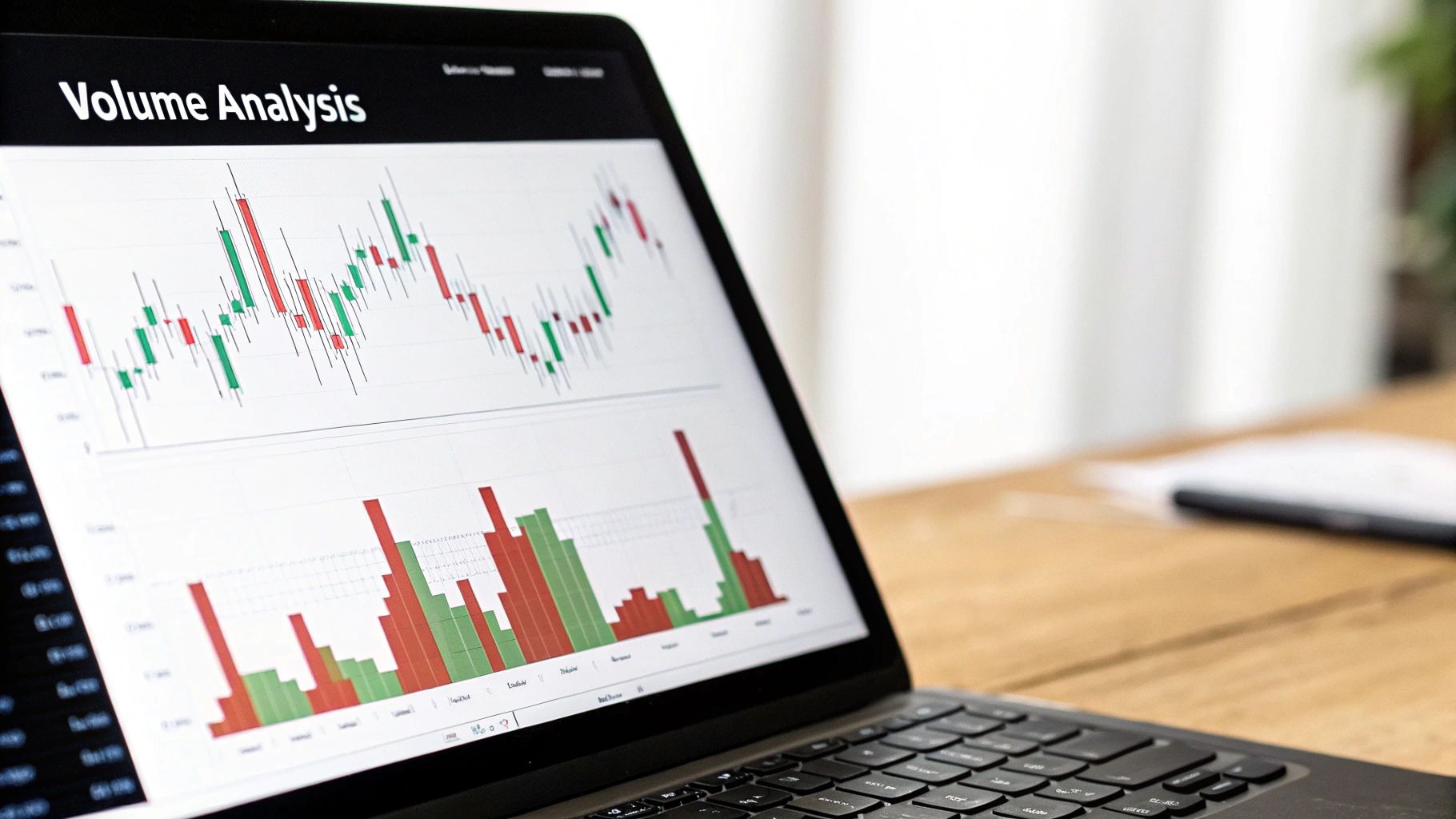
Once you're comfortable reading candlesticks, it’s time to pull in the next piece of the puzzle: trading volume. If price tells you what's happening, volume tells you how strongly everyone feels about it. It’s the difference between a real, sustainable trend and a weak head-fake that fizzles out.
Think about it this way. A big price jump is always exciting. But if it happens on tiny volume, it's like a rock concert with a cheering crowd of ten people. It looks impressive for a second, but there's no real substance. On most charts, you'll see volume as a set of vertical bars at the bottom, usually color-coded to match the price candles (green for up days, red for down days).
What High and Low Volume Reveal
A healthy trend, whether it’s climbing or falling, needs strong volume to back it up. When a coin like Bitcoin smashes through a major resistance level, you want to see a huge spike in green volume. That’s your confirmation—it tells you a ton of buyers are piling in, giving that breakout a much better chance of sticking.
On the flip side, low volume is often a huge red flag.
- Price Rises on Low Volume: This is a classic warning sign. It suggests buyers aren't really committed. The price might be drifting up on fumes, making it incredibly vulnerable to a sudden drop.
- Price Falls on Low Volume: This can be a good thing. It might mean the sellers are getting tired and the downtrend is running out of gas, possibly creating an entry point for buyers.
Pro Tip: Don't just stare at one volume bar. Context is everything. An "average" volume day doesn't tell you much. You're hunting for the outliers—the massive spikes or the unusual dry spells that stand out from the recent past. Those are the moments signaling a real shift in who's in control.
The Power of Volume Divergence
This is where things get really interesting. Divergence is when the price and volume start telling you two completely different stories. It's often one of the earliest and most reliable clues that a trend is getting exhausted and a reversal could be coming.
For example, let's say a crypto is in a killer uptrend, making new high after new high. But on the latest new high, you look down and see the volume is way lower than it was on the previous peaks. This is a classic bearish divergence. The price is still going up, but the weak volume is screaming that the momentum is dying.
This concept has become even more critical as the crypto market has exploded. With the number of global crypto users blowing past 400 million—adding nearly 40 million in just six months of one year—the trading floors are more crowded than ever. This extra activity makes volume analysis essential. When you spot divergences like rising prices on falling volume, it’s a sign that the crowd's conviction is fading. You can dig into the data on this incredible growth and its market impact over at Statista.com.
Diving Into Key Technical Indicators
While candlesticks and volume give you a raw feel for the market’s energy, technical indicators are like specialized instruments that help you measure it precisely. These are essentially calculations based on price and volume, plotted right onto your chart to bring clarity to trends, momentum, and volatility.
Think of them as overlays that transform messy price action into signals you can actually use. Instead of just guessing if a trend is strong, indicators can offer mathematical confirmation. That’s a huge step toward making more objective, less emotional trading decisions.
Smoothing Out the Noise with Moving Averages
One of the most foundational indicators you'll ever use is the Moving Average (MA). It’s brilliant in its simplicity: it smooths out price data by creating a constantly updated average price. This filters out all the distracting short-term noise to reveal the true underlying trend.
If the price is consistently trading above its MA, the trend is generally considered bullish. If it’s below, it’s bearish. Simple as that.
Many traders, myself included, keep a close eye on the 50-day and 200-day MAs to gauge the long-term health of an asset. A classic bullish signal in crypto is the ‘golden cross’—when a short-term MA (like the 50-day) slices up through a long-term one (like the 200-day). This pattern has signaled major bull runs for Bitcoin and Ethereum more than once. When you combine this with strong volume, it becomes a much more reliable forecast. You can even dig into historical price data yourself using tools on CoinMarketCap.
Measuring Momentum with the Relative Strength Index (RSI)
The Relative Strength Index (RSI) is my go-to for gauging momentum. It’s an oscillator that measures the speed and change of price movements on a simple 0 to 100 scale. Its main job is to help you spot overbought or oversold conditions before the rest of the market does.
- RSI above 70: This is a warning light. It suggests the asset might be overbought. Prices have climbed too fast, and the asset could be due for a pullback.
- RSI below 30: This signals the asset is potentially oversold. Prices have dropped sharply, and it might be primed for a bounce.
Imagine a coin has been rocketing up for a week straight. The chart looks fantastic, but a quick glance at the RSI shows a reading of 85. That’s a major red flag telling you the buying frenzy is getting overheated. It’s a cue to be cautious, maybe take some profits off the table, and not get swept up in the hype.
Key Insight: The RSI is most powerful at its extremes. A reading of 50 is just neutral territory, but a push above 70 or a drop below 30 is a signal that demands your full attention. It’s your early warning system for trend exhaustion.
Gauging Volatility with Bollinger Bands
So, how wild is the market right now? Is it calm or chaotic? That's where Bollinger Bands shine. This indicator is made up of three lines: a simple moving average in the middle, with an upper and lower band plotted two standard deviations away from it.
The real magic is in how the bands behave. They expand when volatility is high and contract when volatility is low. This "squeeze" and "expansion" cycle can be incredibly telling. A period of very low volatility (tight, squeezed bands) is often the calm before the storm—a precursor to a big, explosive price move.
Traders use the bands to identify potential turning points. A price touching the upper band might be seen as overextended and due for a reversal, while a tag of the lower band could signal a prime buying opportunity. Mastering indicators like these is essential for timing your entries and exits. To level up your skills, check out our guide on the best swing trading indicators you should know.
Building a Cohesive Trading Analysis
Think of candlestick patterns, volume, and indicators as individual instruments. On their own, they can play a simple tune. But when you learn to conduct them together, you get a symphony. That’s what effective chart reading is all about—combining these elements to build a complete story of what the market is doing.
A single signal might give you a hint, but true conviction comes from seeing multiple, independent signals all pointing in the same direction. It’s a process of layering confirmations, like fitting puzzle pieces together until a clear picture emerges.
Creating a Practical Framework
Let's walk through how this works in the real world. Imagine you're watching a coin that’s been bleeding out for weeks in a downtrend. You have a gut feeling a reversal might be on the horizon. How do you confirm it?
You don’t just jump in. You look for a sequence of events.
First, get the big picture. You pull up the 50-day and 200-day Moving Averages. You notice that after a long time trading way below both lines, the price has started to flatten out and is inching closer to the 50-day MA. That’s your first clue: the bears are getting tired.
Next, look for a trigger. As the price hovers around a known historical support level, you spot a bullish engulfing candlestick pattern. This is a powerful, specific sign that buyers are stepping in with force, soundly rejecting lower prices. It’s a moment of conflict, and the bulls just won a battle.
Then, demand proof. A candlestick pattern is nice, but is there money behind it? You glance at the volume bars. That bullish engulfing candle is paired with a massive spike in trading volume, far higher than the recent average. Now you have confirmation. This isn’t just a flicker of hope; there’s real conviction behind the move.
Finally, plan your exit. You’ve entered the trade, but the job isn't done. You start monitoring the Relative Strength Index (RSI). As the price rallies, you watch the RSI climb toward the 70 level. This is your heads-up that the coin is becoming overbought. It helps you map out an exit strategy to take profits before the momentum fizzles out.
This infographic shows a similar process focused on finding those critical support and resistance levels.
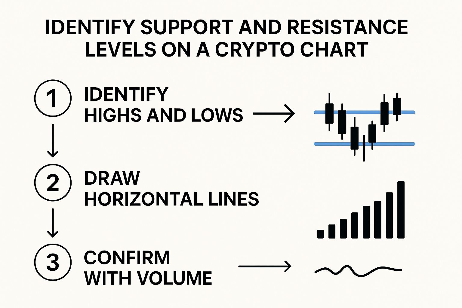
As you can see, confirming a potential support or resistance flip with a surge in volume adds a massive layer of credibility to your analysis. It separates the real moves from the fakeouts.
By layering these tools, you stop reacting to what the price did and start anticipating what it might do. You’ve confirmed a potential trend shift, pinpointed an entry, verified its strength, and planned your exit. That’s the heart of a solid trading plan.
The Role of Broader Market Sentiment
Of course, no chart exists in a vacuum. You can have the most picture-perfect technical setup in the world, but it can still get steamrolled if overwhelming fear or greed suddenly floods the market. That's why considering the overall market mood is essential.
Tools that measure this collective emotion are invaluable. Our detailed guide to the Cryptocurrency Fear and Greed Index shows you how to add this final, crucial layer to your analysis. It helps ensure you’re trading with the market’s psychological current, not fighting against it.
Common Questions About Reading Crypto Charts
It’s one thing to learn about these tools in a vacuum, but using them when real money is on the line is a completely different ballgame. As you start putting these concepts into practice, you're bound to have questions. It's totally normal.
Let's walk through some of the most common hurdles new traders face. Getting these sticking points sorted out will help you move from theory to confidently making calls in a live market.
What Is the Best Time Frame to Use?
This is probably the question I hear most often. The honest answer? It depends entirely on your strategy and what you’re trying to achieve.
- Day traders live in the fast lane. They’re in and out of trades within the same day, so they lean on super short time frames—think 1-minute, 5-minute, or 15-minute charts—to catch quick, small moves.
- Swing traders are playing a longer game, holding positions for days or even weeks. For them, the 4-hour, daily, or weekly charts are far more useful for spotting bigger trends and key turning points.
- Long-term investors zoom out even further. They’re looking at monthly charts to get a bird's-eye view of the entire market cycle, helping them make major strategic moves.
If you’re just starting, a great approach is to use multiple time frames. Get your bearings on the daily chart to see the main trend, then drill down to a 4-hour or 1-hour chart to fine-tune your entry and exit points.
The biggest mistake you can make is trying to day trade off a weekly chart or invest for the long term using a 5-minute chart. Always match your time frame to your trading strategy.
How Reliable Are Candlestick Patterns?
Candlestick patterns are fantastic for getting a read on market psychology, but let's be clear: they are not foolproof signals. This is especially true in the wild, volatile crypto market.
Their real power comes from confluence—when multiple signals all point to the same conclusion.
A random bullish engulfing pattern in the middle of a flat, sideways trend? It probably doesn't mean much. But that same pattern appearing at a major support level, backed by a huge spike in volume, and confirmed by an oversold RSI? Now that's a signal you should pay attention to.
Always look for confirmation. Never, ever base a trade on a single pattern alone. Think of it as a clue, not a conclusion.
Do I Need to Know Complex Math?
Absolutely not. While technical indicators are built on mathematical formulas, modern charting platforms do all the heavy lifting for you.
Your job isn't to be a mathematician; it's to be an interpreter. You need to understand what the squiggly lines are telling you. For instance, knowing that an RSI above 70 suggests an asset might be overbought is a skill of interpretation, not calculation. It’s about recognizing patterns and connecting the dots between price, volume, and indicators.
Another huge piece of the puzzle is market psychology. Understanding how sentiment sways the market is critical, and layering that data on top of your technical analysis can be a game-changer. Our guide on the crypto Fear and Greed Index is a great place to start learning how to do just that.
Ready to transform market sentiment into your strategic advantage? With Fear Greed Tracker, you can access real-time Fear & Greed scores for over 50,000 assets, helping you make smarter, data-driven decisions. Stop guessing and start analyzing with our powerful suite of tools. Explore live sentiment scores on Fear Greed Tracker today.